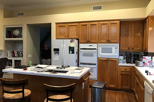
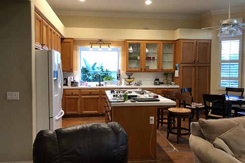
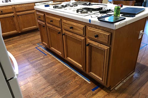
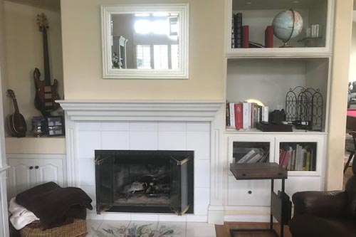
Interested in what it looked like before? Scroll down to see our transformation pictures!
Project Description
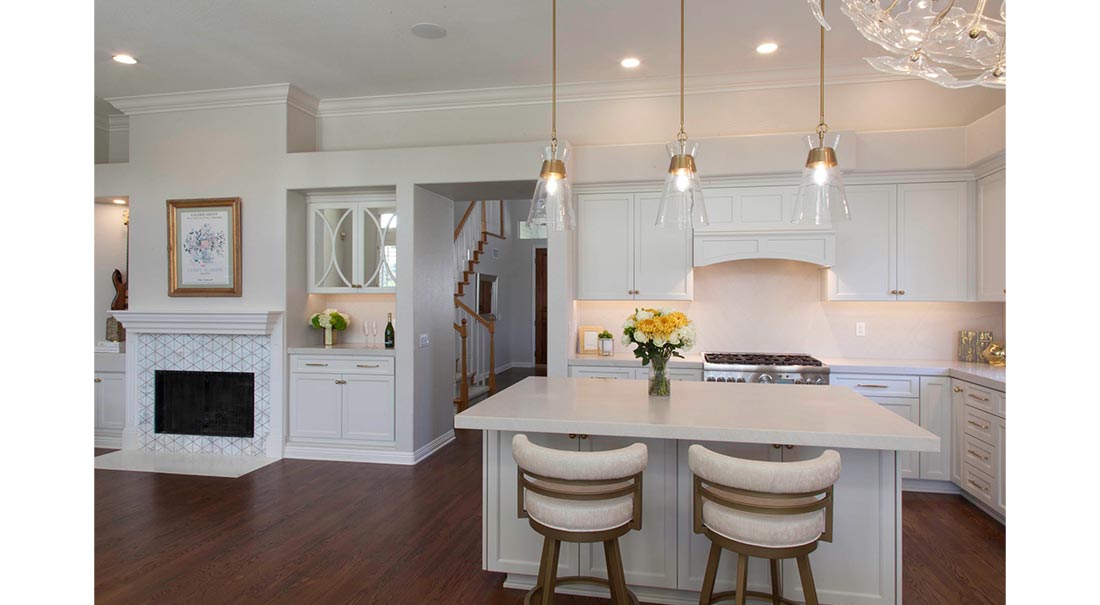
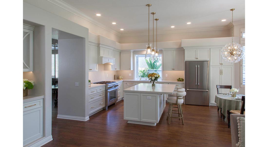
White does not need to be boring! When this couple described their dream kitchen, they both agreed on white cabinets, great appliances, and more counter space. She imagined a dark, soapstone countertop and fireplace surround to create a strong contrast, and he imagined a light countertop for a monochromatic feel. During the design process, we realized they both appreciated the subtle details in finishes and moved forward with a plan.
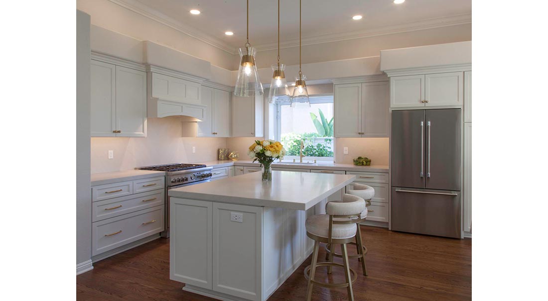
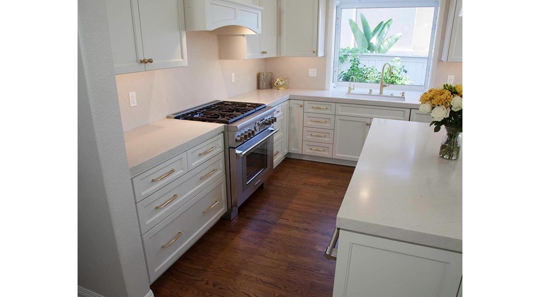
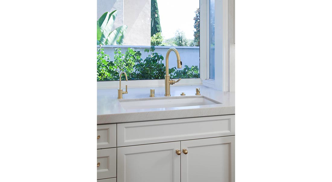
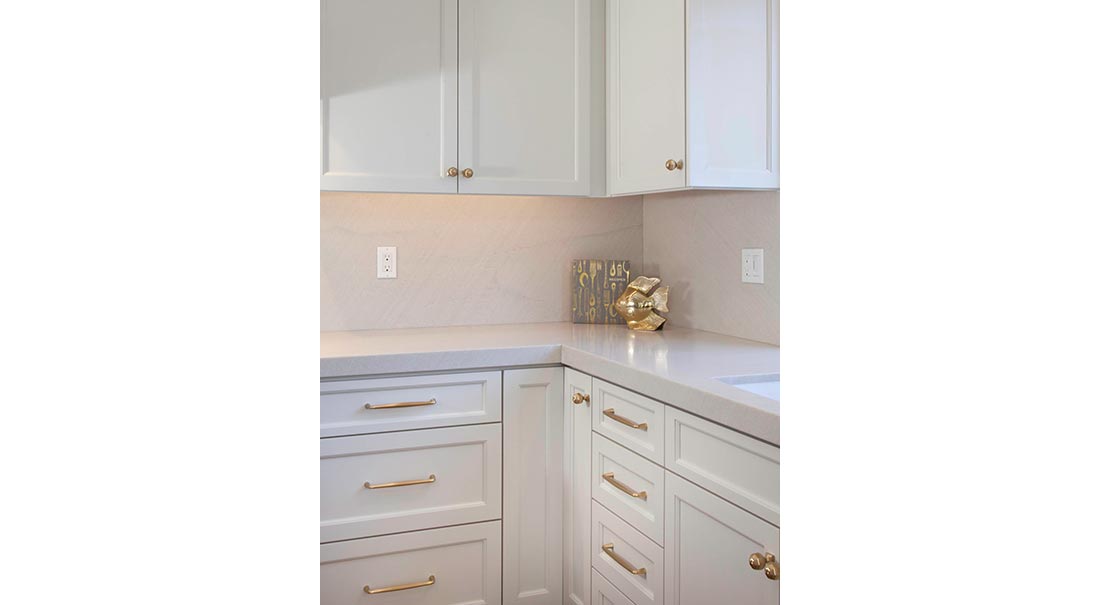
They landed on a beautiful white natural stone that has lots of depth and subtle veining for the counters. To add contrast, gold hardware, plumbing and lighting pops against the white backdrop. The hardware and lighting have beautiful shapes to create artistic style in the space.
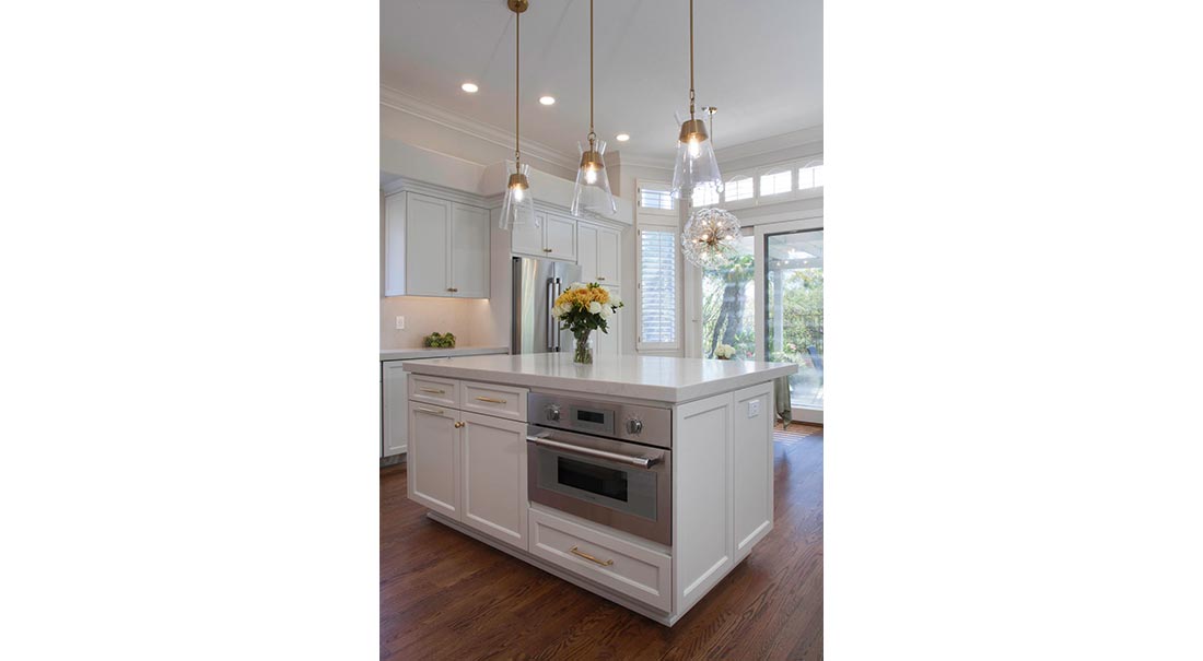
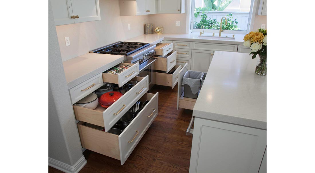
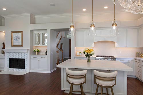
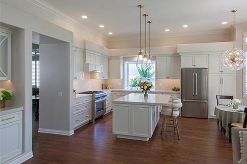
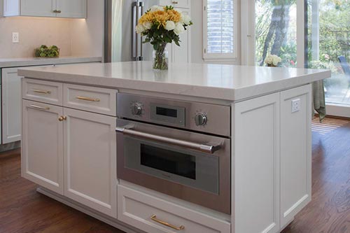
The layout of the original kitchen left very little workspace next to the cooktop. Cue the reconfiguration! By moving the fridge closer to the sink and the speed oven to the island, the back wall opened for the range with ample prep surface on either side. Relocating the cooktop made the island more accessible to gather around and created additional storage.
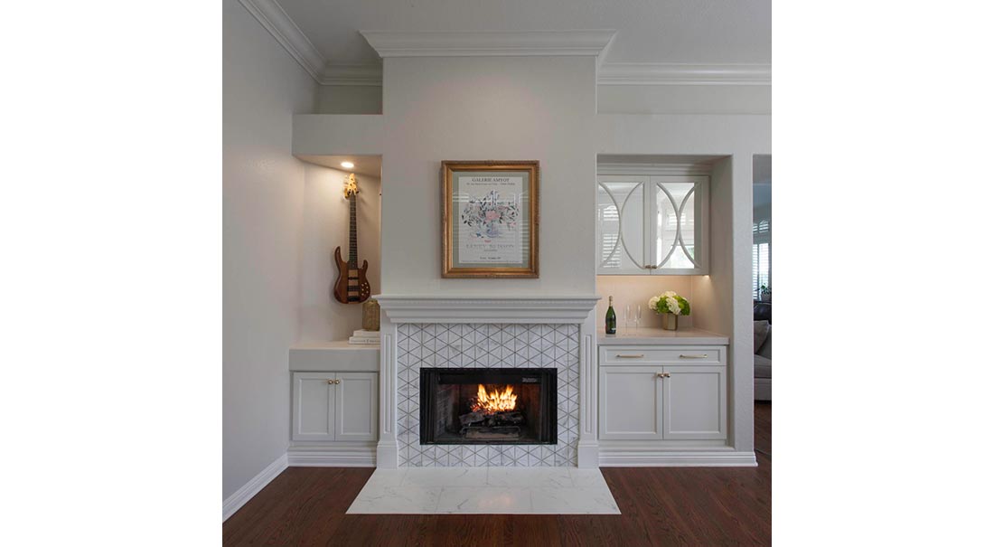
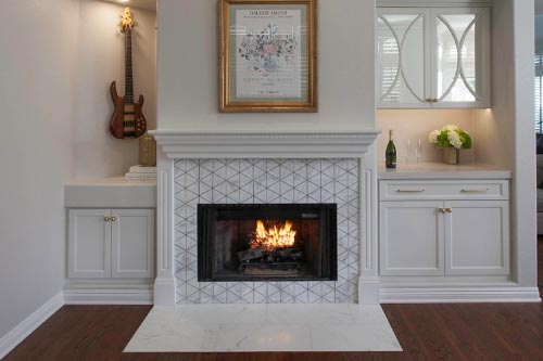
The kitchen is adjacent to the family room, so it would have been amiss to leave the fireplace as-is. Fresh paint, new cabinets, and a fun gold and marble tile gave this wall personality worthy of the jam sessions that take place here. Mirrored cabinets with a beautiful, curved door detail keeps the space light. The best part is that a favorite art piece that used to hang in a room that was rarely used has now found a home front and center, where it can be admired more often.
Before and After Photos
