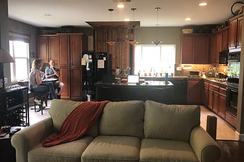
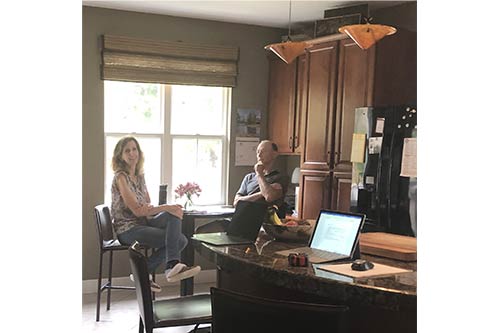
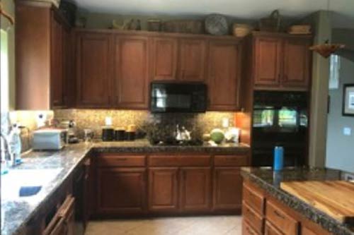
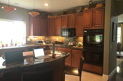
Interested in what it looked like before? Scroll down to see our transformation pictures!
Project Description
A water leak! What no homeowner ever wants to hear. A couple called us with this disturbing news about their kitchen. While they could have just fixed the drywall damage and had new cabinets made to match their existing, they looked at the misfortune as an opportunity. Let’s update the kitchen!
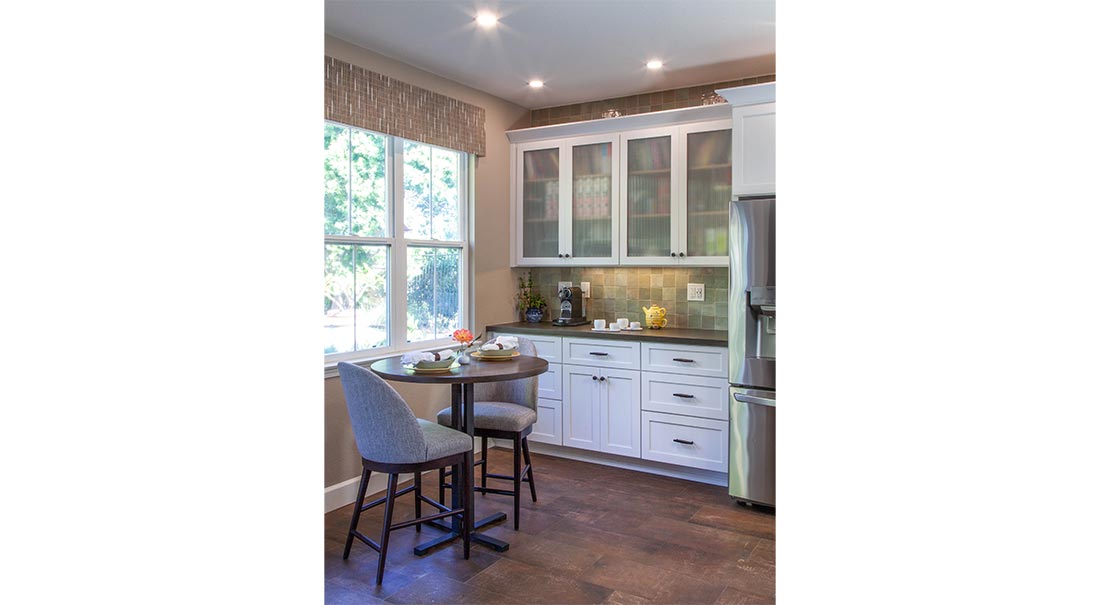
They liked the functional layout of their kitchen but were looking to reconfigure the pantry area. They dreamed of having a coffee bar with organized storage above and below. They weren’t sure how to handle the kitchen flooring; they loved the look of one flooring throughout but didn’t love the idea of wood on the kitchen floor. Although their home had more traditional details, they wanted something simpler and more architectural for their new kitchen. However, we wanted to make sure the new kitchen didn’t look out-of-sorts with the rest of their home.
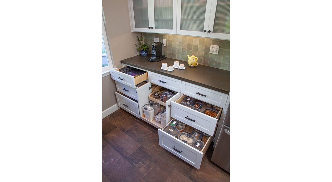
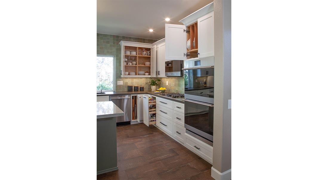
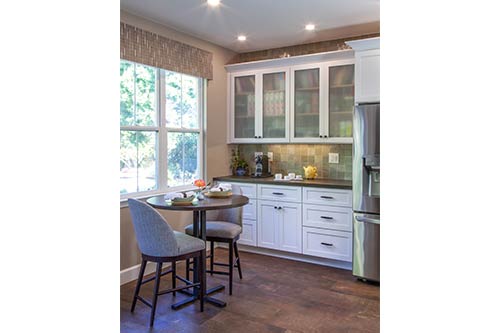
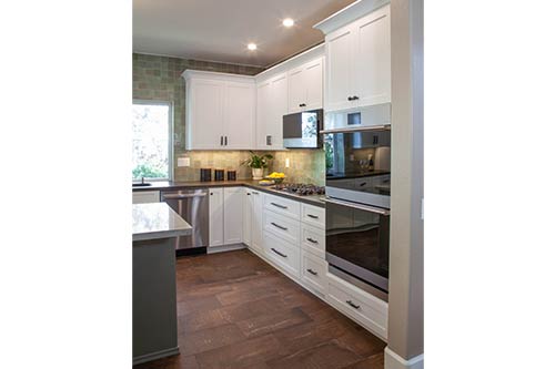
As always, we started with the layout. A six-foot counter to the left of the refrigerator became the new coffee bar. The drawers below were designed to hold coffee pods, teas and sweeteners. Deep drawers and rollouts are used for easy access to pantry items. A variety of cups peek through the reeded glass doors of the cabinets above.
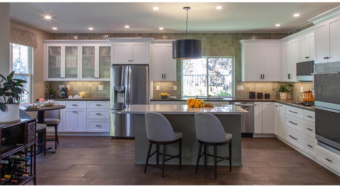
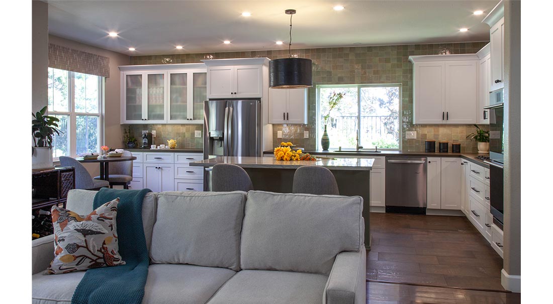
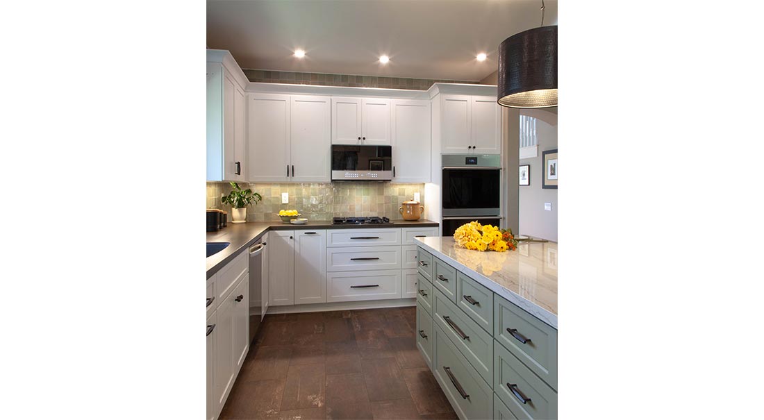
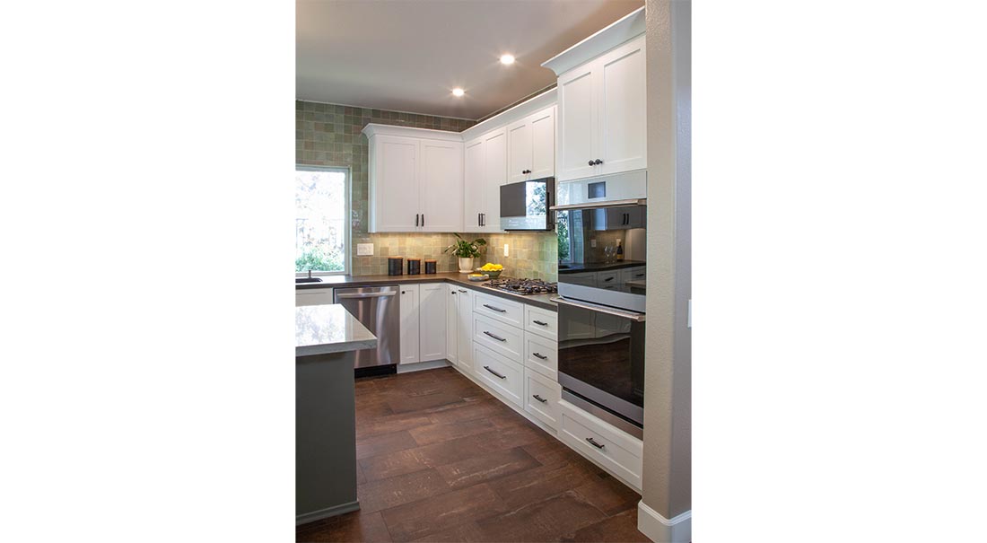
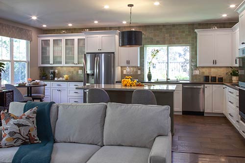
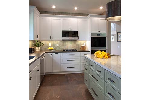
The black appliances were swapped out for sleek, stainless options. These help to give the new kitchen a modern vibe. Next, we moved to the finishes. They fell in love with a green zellige tile which covered the backsplash area from the counter to the ceiling. The subtle variety of colors and hand-crafted look of the tile were perfect for keeping a bit of a traditional feel to the space. We selected transitional white shaker cabinets for the perimeter cabinets and brought the muted green tile color into the island cabinets.
For the flooring, we landed on a tile a similar color to their existing wood floor. This gives the impression of one flooring throughout the space. The perimeter countertop is a charcoal gray with some of the floor’s rust color running through it. We selected a porcelain material for its durability and contemporary, concrete look. The island counter has veins of sage green in a light-colored quartzite, repeating the colors of the white perimeter cabinets and green backsplash.
For the final details, dark chunky cabinet hardware was chosen to create a strong contrast with the cabinets and tie into the dark countertop. The pendant over the island has a hammered metal finish and throws out a dramatic spotlight on the quartzite counter.
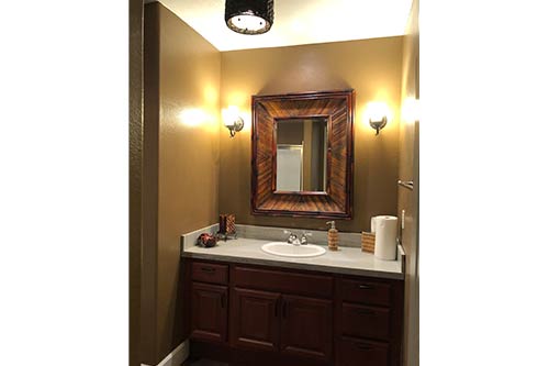
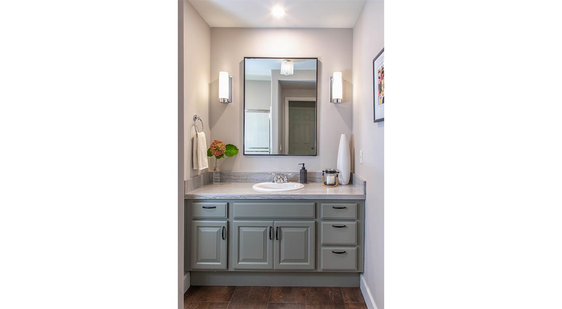
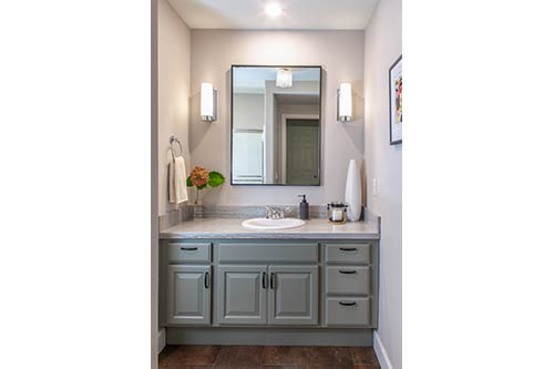
The homeowner’s decided to give the adjacent powder room a refresh as well. The cabinets were painted the same color as the island, and the remainder of the island’s counter slab was used for the vanity counter and backsplash. A streamlined mirror and sconces replaced the darker predecessors, and the walls got a fresh coat of lighter paint. Easy swaps for a big impact!
Before and After Photos
