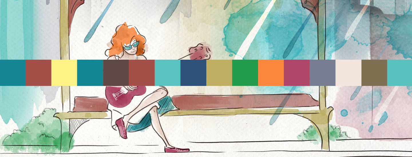
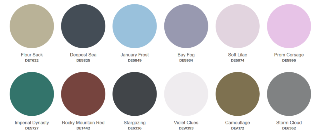
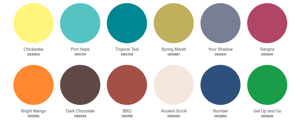
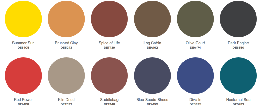
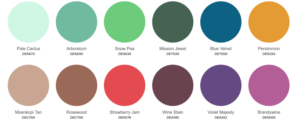
Dunn-Edwards Paints has released their 2019 color trends. The theme for this year: “Spirited Journeys”. Each of the five color trends highlight textures, materials, and cultural references that inspired the palette. Check out each palette below!
Extreme Odyssey
Inspired by embracing visionary experimentation, innovations in architecture and minimalist design. Here’s what Dunn-Edwards has to say about this palette:
Color is a postmodern blend of aquatic, icy, pearlescent, and techno tones that redefines the impossible. Mysterious and entrancing, beyond normal understanding. A dream of a future, inspired by embracing the innovative and visionary ideas. With influences of deep sea and outer space explorations, the Extreme Odyssey color palette highlights a techno-fiber softness with iridescent flashes layered over neutrals and pastels. Creating a transparent and delicate filmy quality, these hues morph between digital and organic, contrasting the light and dark hues. The aquatic tones add depth to the opalescent palette, allowing textural effects to take the lead.
City Stroll
The City Stroll palette is playful, joy filled, and artsy. This palette radiates friendly vibes and touches of humor. Dunn-Edwards describes these colors as:
Saturated fruity hues blend natural energy with modern techno influences. City Stroll tantalizes with vivid overtones, lively and charged with energy. Intense patterns play with notes of vibrant tropical spirit, dulcet tones, ebullient and halcyon hues, along with a pastiche blend of ornamentation. Dazzling, hyper-saturated brights are paired with bright white, hologram metallics are softened with pastels, sporty graphic colors bring power and radiant monochromes shine. A medley of floral tones are toned down by dark chocolate, deepest violet and synthetic blue.
Poetic Passage
Poetic passage plays with shadow and light, feminine and masculine. A palette with softness, sophistication, glamour, and innovation. Here’s what Dunn-Edward’s says:
Delicate neutrals and dusty pastels evoke subtle opulence, soothe and reassure. Poetic Passage captures nostalgic ideals. This introspective, opulent and becoming color palette is understated and demure with tones of romance and formality. Bleached, fresh neutrals and warm naturals are lit by cool icy tones, casual blues, and tender pinks that are paired with graphic colors. Sophisticated nude palettes infuse a tender, natural warm range of hues that are transparent and delicate.
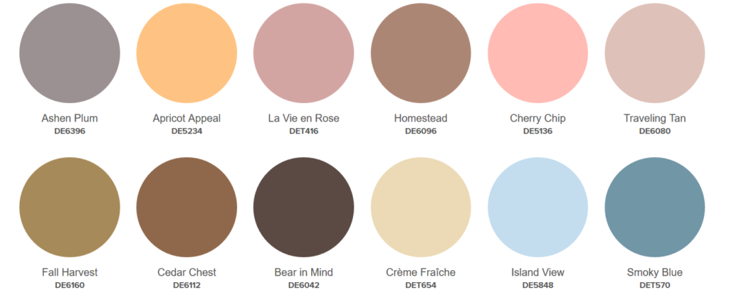
Sojourn blends layers of cultures and eras with naturalistic earthy expressions. It has a careful balance between modesty and grandiose. Dunn-Edwards explains the palette as:
Earthy hues ground the soul and encourage self-expression. Sojourn is sophisticated with tempered earthy hues are reminiscent of early naturalists, while masculine deep tones are highlighted with sporty and outdoorsy aesthetic. Classic and graphic. Natural and chic. Sporty and playful. The urban and natural multicolored, multipurpose palette consists of simple primaries mixed with outdoorsy olive, brown and ochre. A blend of neutrals with primaries to renew the folklore aesthetic inspired by archival qualities. Naturally rich colors of perennial and mountain flowers pair with autumnal earthy hues.
Country Caper
Country Caper is based around creativity and personal expression. It’s influenced by bountiful flowers, textures, and architecture. This palette is colorful, modest, majestic, evoking drama and a sophisticated Bohemian mood. Dunn-Edwards defines these colors as:
Classic and elegant tones of rich hues are layered with graceful overtones. Country Caper color renews the essentials of food and furnishings. Refined and enduring. These updated opulent classics take on a cheerful and fancy display of intense, deep shades, grounded with dark brown. Add fresh, moisture-drenched, succulent hues. This series of greens — soft, grayed, dark or chemical chlorophyll—add perkiness to the palette. Layer with juicy red and chalky neutrals, plus a range of other lush hues to create lush gourmand nuances in a refined artistic mood.
To read more about each of these palettes and see them used in a space, click here.
